Creating a new widget
Project Structure
Get familiar with how the project is organized:
TablissNG/
├─ src/
│  │
│  ├─ plugins/
│  │  ├─ backgrounds/          # Background image providers
│  │  │  ├─ unsplash/
│  │  │  ├─ apod/
│  │  │  ├─ wikimedia/
│  │  │  └─ ...
│  │  │
│  │  └─ widgets/              # All widgets live here
│  │     ├─ clock/
│  │     ├─ greeting/
│  │     ├─ topSites/
│  │     ├─ todos/
│  │     ├─ quote/
│  │     ├─ weather/
│  │     ├─ ...
│  │     └─ index.ts
│  │
│  └─ views/                   # App shell, dashboard and settings screens
│     ├─ App.tsx
│     ├─ dashboard/
│     └─ settings/
│
├─ dist/                       # output folder for extension builds
│
├─ rspack.config.js
├─ package.json
└─ README.md
Rspack is a fast, Rust-based bundler. In most cases, you can just use it like Webpack.
Creating a widget
Widgets live inside /src/plugins/widgets/.
A widget consists of:
- a UI component
- a settings panel
- a config file
- optional logic (API, hooks, styles, types, messages, etc.)
/src/plugins/widgets/
    ├─ myWidget/                    # Your new widget!!
    │  ├─ MyWidget.tsx
    │  ├─ MyWidgetSettings.tsx
    │  ├─ index.ts                  # Widget config
    │  └─ api.ts                    # (optional)
    │     hooks.ts
    │     types.ts
    │     MyWidget.sass
    │     ...
    │
    └─ index.ts                     # Central widget registry
Below is a quick tutorial to create a new widget.
Tip: Looking at existing widgets in
/src/plugins/widgets/is a great way to learn how things work. Each widget demonstrates different patterns and features you might need for your own widget.
Main component (UI)
This is what users see on the dashboard.
// MyWidget.tsx
import { defaultData, Props } from "./types";

const MyWidget = ({ data = defaultData }: Props) => {
  return <>hello {data.name || "there"}!</>;
};

export default MyWidget;
Notes:
datacontains your widget’s saved state.- The state is automatically persisted by the
useApihook (seesrc/hooks/useApi.ts).
This project uses
.sassfor styling. You should look at other.sassfiles for examples, although its pretty similar to regular CSS. You can import the styles in your main component or settings component depending on where they are needed.
Settings component
This component lets users configure the widget.
// MyWidgetSettings.tsx
import { FormattedMessage } from "react-intl";
import { DebounceInput } from "../../shared";
import { Props } from "./types";

const MyWidgetSettings = ({ data, setData }: Props) => {
  return (
    <div>
      <label>
        <FormattedMessage
          id="plugins.mywidget.name"
          defaultMessage="User name"
          description="MyWidget name title"
        />
        <DebounceInput
          type="text"
          value={data?.name}
          onChange={(name) => setData({ ...data, name })}
        />
      </label>
    </div>
  );
};

export default MyWidgetSettings;
Widget Configuration
This connects everything together and exports the widget configuration.
// index.ts
import { defineMessages } from "react-intl";

import { Config } from "../../types";
import MyWidget from "./MyWidget";
import MyWidgetSettings from "./MyWidgetSettings";
import { defaultData } from "./types";

const messages = defineMessages({
  name: {
    id: "plugins.mywidget.name",
    defaultMessage: "My Widget",
    description: "Name of my widget",
  },
  description: {
    id: "plugins.mywidget.description",
    defaultMessage: "Hello",
    description: "Description of my widget",
  },
});

const config: Config = {
  key: "widget/mywidget",
  name: messages.name,
  description: messages.description,
  defaultData,
  dashboardComponent: MyWidget,
  settingsComponent: MyWidgetSettings,
};

export default config;

// Don’t overthink this. Most of this is boilerplate. :)
Notes:
- Each widget has a
keydefined here. - Each widget instance gets its own generated
idfor storage. (This lets users add the same widget multiple times and configure each one independently).
react-intl is used for translations, so please include a meaningful description for translators.
// types.ts
import { API } from "../../types";

type Data = {
  name: string;
};

export type Props = API<Data>;

export const defaultData: Data = {
  name: "",
};
Keep
Dataflat.useApishallow-mergesdefaultDatawith the stored data so newly-added fields fall back to their defaults. If you nest an object (e.g.display: { showIcon: true, fontSize: 14 }) and the user only saves part of it, the whole nested object is replaced and the other defaults are lost. Prefer flat keys (displayShowIcon,displayFontSize) instead.
Register the Widget
Finally, add your widget to the registry:
// widgets/index.ts
import myWidget from "./myWidget";

export const widgetConfigs = [
  // ...,
  myWidget, // add your widget here
];
Some widgets rely on extension-specific APIs. Use BUILD_TARGET to include them only where supported.
Run locally
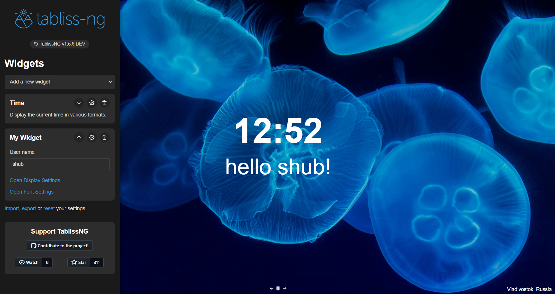
Run pnpm run dev and see your new widget in action! 🎉
(More info in building).
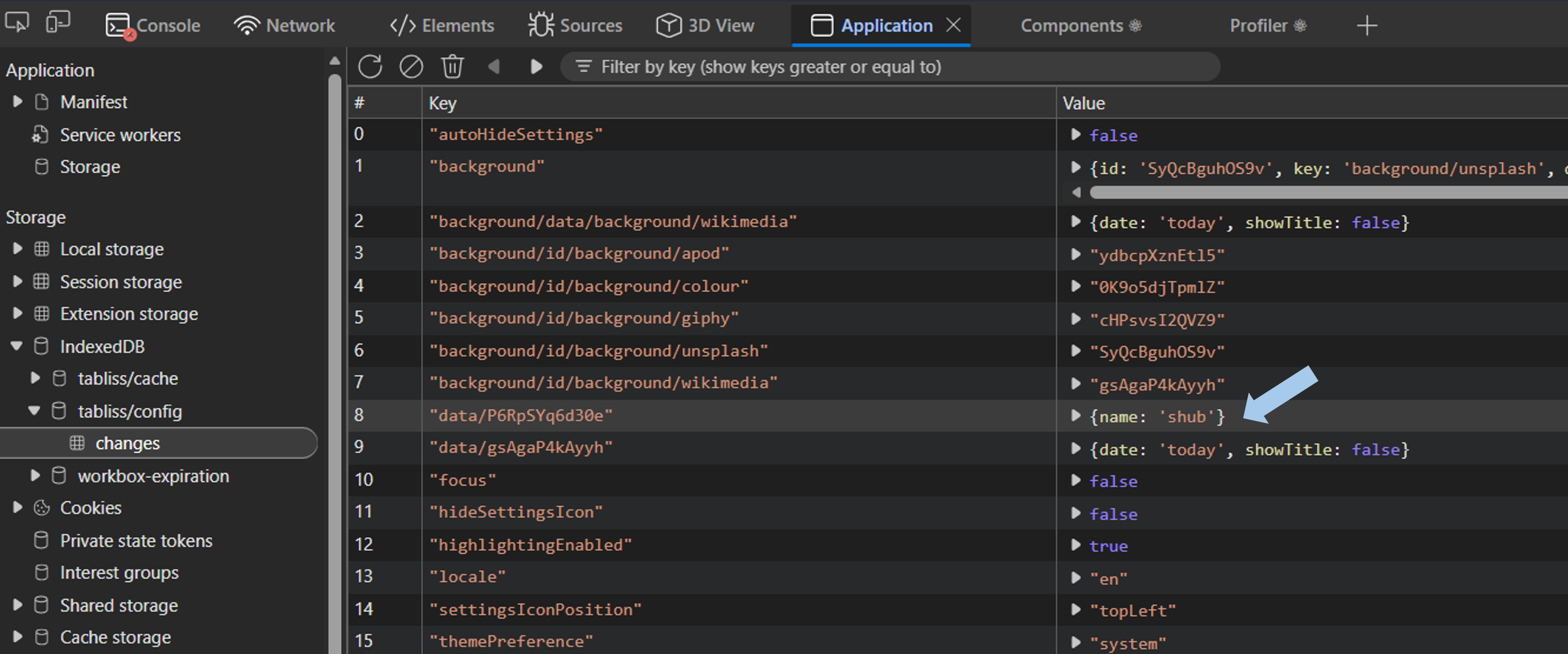
Widget data is stored in Extension Storage (or IndexedDB). You can inspect it via DevTools: